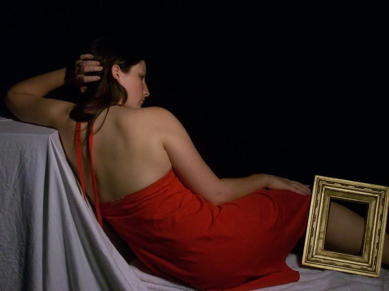
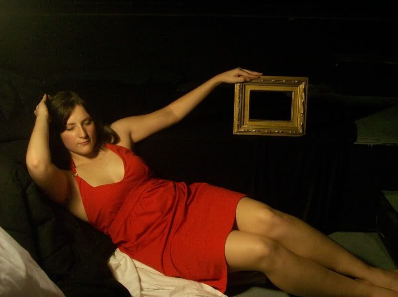
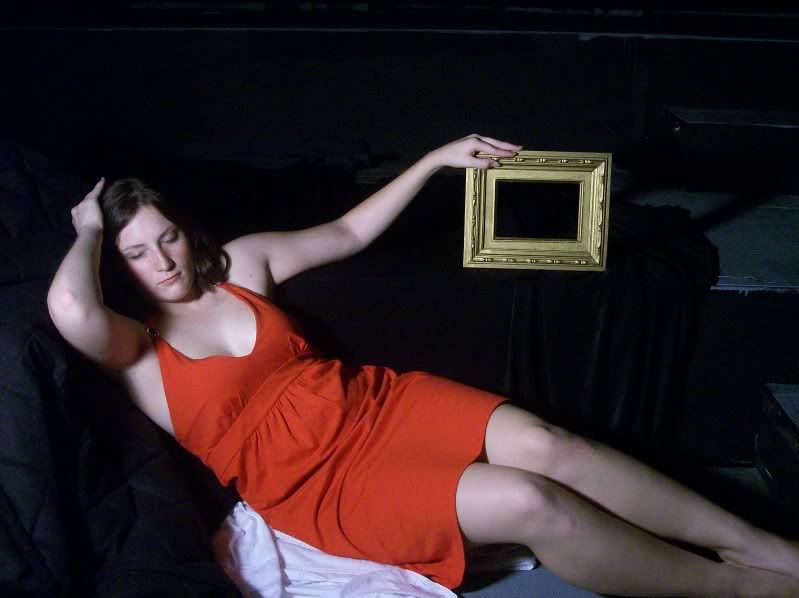
So here are some pictures that I took this past week. I am not sure that they really capture what I want them to but I am thinking of how I can change the background to change the content of the photo. I think the photos turned out really beautifully and I will deffinately be taking many more photos in the next week or two. The empty picture frame is where I will be putting the original artwork thanks to some of you wonderful ideas! Let me know what you all think.


Wow. These have a lot of potential!!!!
ReplyDelete(Photoshop out that tag in the back of that red dress please!)
SOOOO exciting. Do you plan to drop in some kind of "natural setting" for the background? Interesting.
You may not need it. Take more, we may be better off changing the artist statement to suit the images than the images to suit the statement. Images are compelling!
x,
v
this is really good. this is more better than what i expect. i thing second picture of color is better than third one color. this is exciting. i guess you can change model too. it will be more awsome.
ReplyDeleteI think the images are very strong too. The lights and darks, and the colors are so beautiful. I like the idea you're thinking of using with the frames. There is so much you can do with this. :)
ReplyDeleteThese look great! The only one that bothers me is the third photograph because she looks washed out. I like the natural glowing light of the others. They almost look like real paintings! You have everything so organized and I can't wait to see the finished product!
ReplyDeleteThese are really strong. I agree the the coloring of the last image (bluish tone) is a little off and the image above it seems a better fit -- it has more of an orange tone which, to me, has an old and antique feel.
ReplyDeletegreat eye and really solid framing for these photos. it is shaping up quickly
ReplyDeleteBeautiful! These are going to need a lot of photoshopping.. If you need help, give me a ring.
ReplyDeleteGreat job!
I think you are going in the right direction but I think whether it is outside or wherever you do it you have to make it more interesting.
ReplyDeleteThe warm tones on the second one are most like the work you are sourcing from. It is my favorite. I want to see more.
ReplyDeletethese turned out sooooo lovely!!! i cant wait to see more. i think if u photoshoped the background you should use a sublte color or scene so it doesnt look to collaged. Keep it up , im excited to see more
ReplyDeleteI'd like to see painting you're mirroring here. Excited for some more development, there's great potential. Try a background with earthy tones, I think that might work better.
ReplyDeletethe color in the first two photos are working well. they are reminiscent of tones found in old paintings.
ReplyDeleteYou have a great overall idea and your artist book is coming along quite well. Do you have any covers that you might be thinking of doing?
ReplyDelete--Nick Miller
The second photo is right on! The image immediately takes me to another century. The idea of placing another artist depiction in the frame is awesome.
ReplyDeleteI am looking forward to seeing more!
Elaine
I LOVE the first one with your back facing the viewer!!! It looks like Ingres' painting called Grand Odalisque! SO PRETTY!!! I think you should definitely use that one! I cant wait to see more pics! :D
ReplyDeleteWow, you have some beautiful photos! I love the second one you took, it sort of looks like a painting. Keep it up girl!
ReplyDelete